WINDOWS PHONE 7
Vidit Bhargava
The new much anticipated Windows 'Phone' 7 arrived this month and it looks much smarter and cooler! here's all you wanted to know.

1. The UI Improvements
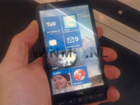
Microsoft has made some really cool UI improvements. They've built upon the Zune OS UI and actually done some brilliant things. Windows Phone 7 is easily the most unique UI in the smartphone race right now, and the real perk here is that it doesn't just seem like an arbitrary decision to make things look different than other OSs -- there is real purpose and utility to a lot of what Microsoft has come up with.
The Keyboard: The Keyboard has been a matter of concern for all these touch screen phones. The Android comes up with the most cramped up version. While the iphone's is quite OK. Here in the Windows Phone 7, you'll see that it is quite cramped but looks neat. This is fine because you will like typing on it, even though it isn't what you expect!
2.The Mail Experience!
Overall, the mail experience is solid, but not best in class. There's a lot here that is laudable (like the sheer snappiness of it), but there's also a fair amount that's missing. We'd really like to see Microsoft strive for threaded messaging, joined inboxes, and an improved server-side search by the time this hits the market, but we're guessing that's asking a lot. You'd like the feel of it, but you do want more of it. It is good, but only looking good!
3. Internet Explorer! Eh?
For as much crap as Internet Explorer gets (less, admittedly, now that the debacle of IE6 is finally starting to fade), we've got to say that web browsing on Windows Phone 7 is actually a really pleasant experience. Our understanding is that it's essentially using desktop-class code, bits and pieces of Internet Explorer 7 and 8 tossed together and massaged into something that'll look (and work) better on a smaller display with less horsepower.
You don't get Silverlight, you don't get Flash support, you don't get the HTML5. The browser lacks the three major components of the web. It is actually quite painfull.
4. Zune
Like the Sony Ericsson phone's have the Walkmann in them, The iPhone's have the iPod. Windows is not behind they have their Zune! Zune is quite nice here. A new UI for the Same also. Zune actually looks smart. And gives you the feel of the Microsoft 'Mp3 player'. And Microsoft doesn't forget to lift a notch from the Apple Competitor. Here also Zune is the centre of things. You can sync photos in the Zune application, and your general account and device management is handled through the app now. But why complain? or did we ever?
5. Everything Else
Ofcourse since the UI has largely improved, you do get Smarter Maps, Office, Camera and Marketplace Apps. Also all looks much neater.
Overall
On the look front, Microsoft has everything new. However as far as the whole OS is concerned. Microsoft Has left behind many things. They've picked up some but its not enough. Windows Phone 7 falls flat on competitors. Though, they've refreshed things up, it isn't enough. The secondary features like the maps, etc.. are good. But the OS lacks largely on the primary and key features to the phone. The SMS service is slow and glitchy to say the least. There is a lot to be done over there. The Mail Experience is primitive. Things are much on the other side. The Android and iOS side. Internet Explorer remains the hatefull internet explorer. There is nothing much good about it. Though things are better on the Office side but then you won't buy a phone only for its Office Suite. I don't see how major mobile companies are going to choose this over the Android OS platform.
